Whilst creating our thriller opening we followed the conventional running order of the title sequence.
 Firstly we started with the ident, the ident shows the production company with their personal logo. Like shown in 'The Stepfather and 'Victim'. Both of these idents have a similar, colour scheme; idents make be designed considering the connotations, connotations which reflect the film that's about to be screened, here the colour scheme and shape of the logo for 'Screen Gems" connotes blood being splattered, which is reflective of a thriller genre. The ident is the first impression so it's clever to hint a theme to the rest of the film.


Once the ident has been shown the production company is shown again, in step father they showed the company on top an establishing shot of a suburban house, this informs the audience of the first location. Whereas in our one we done it on top of trees, we decided we wanted to be a little more discrete and leave the audience guessing the location.


After presenting the companies and associations, it's conventional of title sequences to show the stars therefore we followed this convention. We decided to put the star name on a cinematic view of the setting, as it's clear and the audience can read the name without difficulty and also it situates a location.


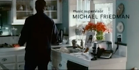
After the stars are shown then comes the names of the casting directors and music, then title. In 'The Stepfather', they show these names whilst the main character is carrying out he's routine, this introduces us to the character and hints a narrative. Wherear we mainly edited the titles upon footage of the surrounds, we done this intentionally therefore, we would leave the audience in suspense and be a little more discrete. The way we edited our title sequence suits our sub genre 'psychological', as it's leaving the audience anticipating and thinking about what's going on in our location.
The title:


We used 'What lies Beneath' for inspiration for our title, as the title is reflective of what's about to happen, the effect they used associated with water, and in the opening the women opens her eyes from being under water. Our title we wanted to reflect the internal state of our main character and the editing rather than the visual aspect, there for we added a flickering effect to represent our main characters blurred memory and the flashbacks in the editing.


We used this shot from 'What lies Beneath' as inspiration for our thriller opening, at first we could only see her eyes, this left the audience wonder for a split second, who could that be? the fact the audience are left waiting for the reveal, makes them use there heads, and also shock them when they find out the character.


No comments:
Post a Comment